Friday, 23 March 2018

Magazine Front Cover Plan/Mark-up


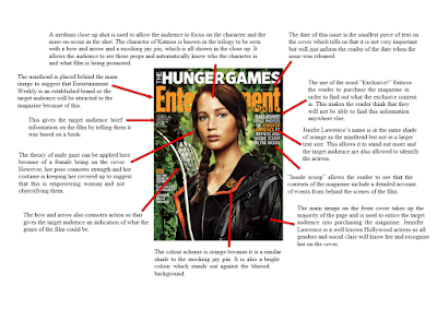
As a group we have started planning what we want our magazine front cover to look like.  We decided that we wanted the majority of the page to be taken up with a photo of the main actress in our trailer.  We want to do this as this is a key convention of film magazine front covers and many well established providers use this convention.  We want our master head to be in a bold, recognisable, large font but not taking away too much attention from the title of the featured film, so we will attempt to have this behind the image of Leanne, this also happens to be seen a lot in film magazines.  The master head is also a crucial convention for a magazine front cover so we want to make ours as professional as we can.  The title of the feature film must be displayed in large font on the magazine front cover in order to grab the audience’s attention and bring it to the feature film.  We decided to have this in a large black font going across the image and in the middle.  This allows the image still to be seen yet the name of the film to be very prominent.  We have added in a barcode and price as this is key for when the consumers purchase the product.

There are various other strap lines and 'add-ons' on the magazine front cover.  The main aim of these is to draw in audiences who may not necessarily be solely interested in the feature film but to show that there are other exciting features in the magazine.  This will hopefully be an incentive for them to buy the magazine and therefore 'stumble' across "Guilty Suspects" accidentally and hopefully become interested, bringing in a wider audience.

We understand that as the process of creating this goes on things may change however this is a template we aim to stick to as we believe it to be atheistically pleasing and interesting for audiences as well as following the key codes and conventions of a film poster. 

Thursday, 22 March 2018

Re-filming and Editing Process

Here are pictures of Georgia during the editing process for our second draft.  We listened to the feedback we were given and followed this to produce an improved product. The main changes that we had to make were to re-shoot and add in blank screens with the names of the actors and different quotes about the film in order to add enigma codes.  We needed to make the story line less fluid so the audience couldn’t guess the whole plot too easily.  We also needed to change some sounds/music in order to make it more dynamic.
This process didn’t take as long as long as we first thought.  The filming process only took a couple of hours on one day and the next day we edited it, which also took a couple of hours.

The first thing that we did in this editing process was to look over the footage we just shot and cut out the parts that we didn’t need.  We then placed it into the original trailer. From then we decided to edit and make the other neccessary improvements.  We then decided to put the text in at different moments, this proved more difficult than we originally thought as we wanted the text to make sense to show what is happening but also to not give too much away.  We decided whilst doing this that we needed to move around the flash backs of the suspects so they followed after their ‘mugshot’, we felt like this breaks up the story a bit.  This caused some issues with the music as it didn’t fit at some points, so we had to edit this later in the process. Once all the text and footage was put in the right place, we decided to re-edit the music, whilst doing this we found another track that we added in order to change the music in attempt to make it more dynamic.
We came across different challenges whilst doing this, one of which was deciding on a font to use for the text on the screen.  We decided to have a different font for the actors’ names and the quotes/other text. We thought this would make the actors’ names stand out, making them more memborable. Another thing we had to decide on was how the text was displayed on the screen, we tried different transitions but eventually found one that we liked and thought worked well with the genre of the trailer.

Changing the order of the footage was a bit difficult as we didn’t want to effect any of the editing we had done to the previously clips, we took our time when doing this so that we didn’t miss any small details or make any mistakes. Re-matching the timing of the music proved more difficult than anticipated but we put good detail into this so that we made sure it works.

Overall this editing process was quite enjoyable because we knew what we had to do and we already had previous experience with the software so we knew how to do it.  From this and the feedback we will receive after showing our target audience we will begin working on our third draft.

Film Poster Plan/Mark Up


As a group, we have now reached a stage where we have drawn up our ideas for the Film Poster and have pictured how we ideally want it to look. We figured that we wanted the image of the main character to be the main focus of the poster as this follows the conventions we have researched. We also wanted the film title to be in a bold, captivating font towards the bottom of the page so that it stands out but also doesn't distract the attention away from the main image. We have also added space at the bottom where we would like head-shots of the four other characters to show they are included in the film. However, with these images, we have an idea that we would like them to be faded into the background so they don't take the focus away from the main image.

Within our poster, we included various other features that are features of a stereotypical film poster. For example, we have entered the BBFC rating in the bottom corner, a review and other works the director has produced.

We are well aware of the fact many things are likely to change in the process of putting the film poster together electronically.

Magazine Title Ideas


Once I finished the magazine and poster analysis' we started work on our magazine front cover. First we had to come up with a name for the magazine which proved harder than we thought.
As a group we came up with a few ideas that we thought would be appropriate. Next we asked members of our target audience which name they most liked.
The image above shows the results, Focus! was the most popular name but closely followed by Cinematic. After we got the results back we decided Focus! was more appropriate because it links with the filming industry. 

Wednesday, 21 March 2018

Feedback for Second Cut


The feedback we received for our second cut of our trailer was positive and an overall improvement on our first cut, which is what our aim was.

In our feedback from our first cut we were told that the trailer could be improved by having a change in music, in order to make it more dramatic and create tension.  However, our feedback from our second draft suggests that the change in music was not subtle enough and that it revealed which suspect committed the crime.  For our next draft of our trailer we will try and make the transition in music a lot smoother and perhaps find some music which is less dramatic therefore not insinuating that any of the characters actually committed the crime. 

It was also said that our story line is too clear and doesn’t leave enough enigma codes.  Although the audience does not know who did it, or what happened to day they can guess what is happening and what the outcome might be.  One suggestion was to have some ‘exciting’ happen, which might throw the audience of the scent of what is happening, therefore creating another enigma code.   This for us creates the dilemma if we should re-shoot some parts or completely add something else into our plot line.  This decision we will make as a group.   Another person said that our voice over of Faye told the story too much and gave the characters too much introduction.  We again need to discuss this as a group but we will most probably decide to remove these from the trailer.

One of the improvements that we had to make from the first cut was to add text in-between some of the footage to give the audience some questions to think about and to build suspense.  Our feedback suggests that this was a good idea and the target audience likes it, however we need to think of a better way to display this text.  We currently have the text falling onto the screen however this has not proven very popular amongst our target audience.   We will re-evaluate our use of font and how we display it in order to make it more captivating for the audience.

One key aspect of the feedback was that the audio during the scene at the park is muffled and a bit hard to hear.  As a group we have agreed with this and therefore we need to find a time to re-shoot.  We have also decided that we may change the location of this scene in order to minimise other sounds that are beyond our control.

Feedback also suggests that we need to display the title earlier in the trailer in order to grab the audience’s attention from earlier on.  We also need to make sure that the release date is one of the last things that we see other than the credit block.

Our feedback in the change of music (previously mentioned) that the change in music wasn’t as effective as we originally thought.  It was also suggested that we need to add in different sound effects in order to make the trailer more exciting and gripping.

Overall the feedback was positive and they believed that it was a good trailer however it needs more ‘umph’, we believe that by taking on board this feedback we can get that.

Second Cut Questionnaire Feedback

These are some of the completed questionnaires that we gave to our target audience after they watched the second draft of “Guilty Suspects”. These helped us to see that our second draft is looking more like a film trailer and follows the conventions of one. Something we have to improve is the sound quality during certain scenes so will have planned to reshoot them to improve the sound quality. Another thing we need to improve is that it is too long for it to be a trailer so we will need to shorten it. 


Second Cut Questionnaire


As a group we decided to give our target audience a questionnaire to fill out while they watched the second draft of our trailer. We hope to see some improvement from the first draft and we will use this feedback to improve our second draft. We will also make a third draft if necessary, depending on the feedback we get back.

This is an example of the questionnaire we made.


Guilty Suspects - Second Cut


Saturday, 17 March 2018

Skyfall Poster Analysis


Skyfall (2012) is the twenty-third spy film in the James Bond series produced by Eon Productions. The title is written in white to contrast against the dark coloured background. It uses capital letters and a simple font to make it easy to read and clear to people who are only quickly viewing it so will grab their attention. It is slightly edited to look like it’s worn out however it is still kept simple and plain. The main image used on the poster is of the main character and very well-known actor Daniel Craig, which makes him one of the unique selling points. As the James Bond films are well known this image will instantly attract the attention of the target audience. By seeing the poster, it will make people aware of a new bond film and remember the release date to see it when it comes out. He is wearing a smart suit and looks very professional suggesting business and importance. The black contrast against the white in the background makes the character seem even more superior.

The colours used on this poster are simple and classy using just black and white. It doesn’t have anything cheery or bubbly about it suggesting it focuses on more serious matters and makes it clear the film is not a comedy. By using this colour scheme it also matches the characters suit and is all kept very simple. The image in the background shows London in black and white but the union jack is the only thing in colour making it really stand out, this informs the audience of the main setting in the film.

The use of the gun as a prop for the main character makes it easy for the audience to establish the genre of the film. With a gun involved it would suggest action. Viewers can then instantly decide if they like this genre or not and if they do it will encourage them to want to see the film. The release date is very important as it’s the thing people will look for if they are interested in the film, by putting it in a bold orange against the black background makes it hard to miss and stands out.

Friday, 16 March 2018

Titanic Poster Analysis


Titanic is a 1997 American epic romance-drama film directed, written, co-produced and co-edited by James Cameron. The word ‘Titanic’ is in white, so stands out against the dark colour of the ship. Below this, the credits of the people involved are in gold which has connotations of being grand and high class, much like the titanic. As titanic is such a big historic event and almost all people will have heard of it, seeing the word Titanic stand out in a bold font means more people will be drawn to it.
The picture of the ship takes up most of the shot and is taken from a low angle, portraying Titanic as being grand and superior, showing it to be an iconic ship and also emphasising the size of it.  Another reason for the ship taking up the majority of the poster is the fact that it is the main setting of the film, and is where all the action of the film takes place, making it key to the film. The bow of the ship comes up in between the two lead characters, Jack and Rose, suggesting that they are separated by the Titanic and may try to pull them apart, symbolising one of the key themes as the social divide on-board.

In the picture of the two characters, Jack has his arms wrapped around Rose, showing that the film is of the romantic genre, and also portrays his protective behaviour towards her. She is facing away, suggesting that although it is a romance, there are complications, which is where the theme of drama comes in to play. The background is a cloudy, blue sky. Placed behind the low angle shot of the Titanic, it seems to reinforce the scale and how majestic the ship appears.

The tagline is ‘Nothing on earth could come between them.’ which almost seems to foreshadow some form of tragedy occurring and coming between them. It also says ‘From the Director of Aliens, T2 and True Lies.’ This shows what a famous and successful director James Cameron is making him one of the unique selling points. Since the film is based on a true story the audience already know what to expect and what the genre is.

Tuesday, 13 March 2018

The Dark Knight Poster Analysis


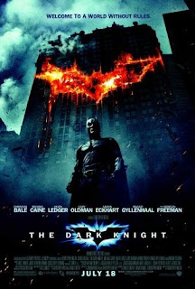
‘The Dark Knight’ is an action-thriller film. The genre of the film is apparent due to the dark tones in colour used along with the Batman symbol which is seen as being on fire. The text on the poster that is most prominent is the title of the film ‘The Dark Knight’, as it is bold and reasonably large; this will make it more memorable for the target audience. The use of the light around the Batman ident illuminates the symbol making it appear attractive and eye catching. Just above the title of the film there is the list of starts names that feature within the film. In my opinion this has been strategically placed, because, being drawn to the title then seeing the next bold text would draw the audience’s attention. Having the stars names on the poster is the unique selling point because the target audience will see the list of featured actors and that may be their reason behind wanting to watch the film. At the bottom of the poster, in bold is the release date, ‘July 28’, this allows the audience to prepare to engage in the film.

On the poster there is a central image of the protagonist, Batman. The protagonist is framed in a low angle shot which makes him appear as a dominant and powerful. The protagonist is wearing an all in one black suit which amplifies his muscularity, along with a mask which shields his identity. The shielding of his identity makes this character more mysterious and the defined muscles show him to be powerful and strong. As well as the character and the title of the film being key aspects of the poster, there are also two images of the trademark Batman ident which stand out significantly. The Bat symbol on the dishevelled building is portrayed as fire burning. This reinforces the genre of the film because it is a convention of the action genre that involves fire which connotes danger.

At the top of the poster, there is a tagline, written in small font which reads ‘welcome to a world without rules’. A tagline gives a hint or a clue as to what the film is about so this will make the audience think it is action packed. The white typography works well up against the dark background, it allows the titles and the actors to stand out significantly more than the credits at the bottom and where it says ‘A Film by Christopher Nolan’. It seems that the most important information is put in the bigger sized, white and bold font while other things are slightly less clear.

Evaluation Question 4