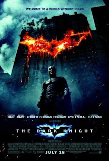
‘The
Dark Knight’ is an action-thriller film. The genre of the film is apparent due
to the dark tones in colour used along with the Batman symbol which is seen as
being on fire. The text on the poster that is most prominent is the title of
the film ‘The Dark Knight’, as it is bold and reasonably large; this will make
it more memorable for the target audience. The use of the light around the Batman
ident illuminates the symbol making it appear attractive and eye catching. Just
above the title of the film there is the list of starts names that feature
within the film. In my opinion this has been strategically placed, because,
being drawn to the title then seeing the next bold text would draw the
audience’s attention. Having the stars names on the poster is the unique
selling point because the target audience will see the list of featured actors
and that may be their reason behind wanting to watch the film. At the bottom of
the poster, in bold is the release date, ‘July 28’, this allows the audience to
prepare to engage in the film.
On the poster there is a central image of the protagonist,
Batman. The protagonist is framed in a low angle shot which makes him appear as
a dominant and powerful. The protagonist is wearing an all in one black suit
which amplifies his muscularity, along with a mask which shields his identity.
The shielding of his identity makes this character more mysterious and the
defined muscles show him to be powerful and strong. As well as the character
and the title of the film being key aspects of the poster, there are also two
images of the trademark Batman ident which stand out significantly. The Bat
symbol on the dishevelled building is portrayed as fire burning. This
reinforces the genre of the film because it is a convention of the action genre
that involves fire which connotes danger.
At the top of the poster, there is a tagline, written in
small font which reads ‘welcome to a world without rules’. A tagline gives a
hint or a clue as to what the film is about so this will make the audience
think it is action packed. The white typography works well up against the dark
background, it allows the titles and the actors to stand out significantly more
than the credits at the bottom and where it says ‘A Film by Christopher Nolan’.
It seems that the most important information is put in the bigger sized, white
and bold font while other things are slightly less clear.


No comments:
Post a Comment