Saturday, 17 March 2018

Skyfall Poster Analysis


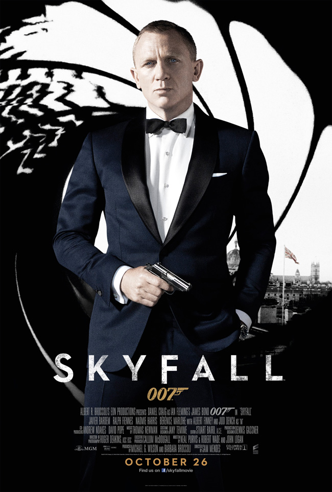
Skyfall (2012) is the twenty-third spy film in the James Bond series produced by Eon Productions. The title is written in white to contrast against the dark coloured background. It uses capital letters and a simple font to make it easy to read and clear to people who are only quickly viewing it so will grab their attention. It is slightly edited to look like it’s worn out however it is still kept simple and plain. The main image used on the poster is of the main character and very well-known actor Daniel Craig, which makes him one of the unique selling points. As the James Bond films are well known this image will instantly attract the attention of the target audience. By seeing the poster, it will make people aware of a new bond film and remember the release date to see it when it comes out. He is wearing a smart suit and looks very professional suggesting business and importance. The black contrast against the white in the background makes the character seem even more superior.

The colours used on this poster are simple and classy using just black and white. It doesn’t have anything cheery or bubbly about it suggesting it focuses on more serious matters and makes it clear the film is not a comedy. By using this colour scheme it also matches the characters suit and is all kept very simple. The image in the background shows London in black and white but the union jack is the only thing in colour making it really stand out, this informs the audience of the main setting in the film.

The use of the gun as a prop for the main character makes it easy for the audience to establish the genre of the film. With a gun involved it would suggest action. Viewers can then instantly decide if they like this genre or not and if they do it will encourage them to want to see the film. The release date is very important as it’s the thing people will look for if they are interested in the film, by putting it in a bold orange against the black background makes it hard to miss and stands out.

Friday, 16 March 2018

Titanic Poster Analysis


Titanic is a 1997 American epic romance-drama film directed, written, co-produced and co-edited by James Cameron. The word ‘Titanic’ is in white, so stands out against the dark colour of the ship. Below this, the credits of the people involved are in gold which has connotations of being grand and high class, much like the titanic. As titanic is such a big historic event and almost all people will have heard of it, seeing the word Titanic stand out in a bold font means more people will be drawn to it.
The picture of the ship takes up most of the shot and is taken from a low angle, portraying Titanic as being grand and superior, showing it to be an iconic ship and also emphasising the size of it.  Another reason for the ship taking up the majority of the poster is the fact that it is the main setting of the film, and is where all the action of the film takes place, making it key to the film. The bow of the ship comes up in between the two lead characters, Jack and Rose, suggesting that they are separated by the Titanic and may try to pull them apart, symbolising one of the key themes as the social divide on-board.

In the picture of the two characters, Jack has his arms wrapped around Rose, showing that the film is of the romantic genre, and also portrays his protective behaviour towards her. She is facing away, suggesting that although it is a romance, there are complications, which is where the theme of drama comes in to play. The background is a cloudy, blue sky. Placed behind the low angle shot of the Titanic, it seems to reinforce the scale and how majestic the ship appears.

The tagline is ‘Nothing on earth could come between them.’ which almost seems to foreshadow some form of tragedy occurring and coming between them. It also says ‘From the Director of Aliens, T2 and True Lies.’ This shows what a famous and successful director James Cameron is making him one of the unique selling points. Since the film is based on a true story the audience already know what to expect and what the genre is.

Tuesday, 13 March 2018

The Dark Knight Poster Analysis


‘The Dark Knight’ is an action-thriller film. The genre of the film is apparent due to the dark tones in colour used along with the Batman symbol which is seen as being on fire. The text on the poster that is most prominent is the title of the film ‘The Dark Knight’, as it is bold and reasonably large; this will make it more memorable for the target audience. The use of the light around the Batman ident illuminates the symbol making it appear attractive and eye catching. Just above the title of the film there is the list of starts names that feature within the film. In my opinion this has been strategically placed, because, being drawn to the title then seeing the next bold text would draw the audience’s attention. Having the stars names on the poster is the unique selling point because the target audience will see the list of featured actors and that may be their reason behind wanting to watch the film. At the bottom of the poster, in bold is the release date, ‘July 28’, this allows the audience to prepare to engage in the film.

On the poster there is a central image of the protagonist, Batman. The protagonist is framed in a low angle shot which makes him appear as a dominant and powerful. The protagonist is wearing an all in one black suit which amplifies his muscularity, along with a mask which shields his identity. The shielding of his identity makes this character more mysterious and the defined muscles show him to be powerful and strong. As well as the character and the title of the film being key aspects of the poster, there are also two images of the trademark Batman ident which stand out significantly. The Bat symbol on the dishevelled building is portrayed as fire burning. This reinforces the genre of the film because it is a convention of the action genre that involves fire which connotes danger.

At the top of the poster, there is a tagline, written in small font which reads ‘welcome to a world without rules’. A tagline gives a hint or a clue as to what the film is about so this will make the audience think it is action packed. The white typography works well up against the dark background, it allows the titles and the actors to stand out significantly more than the credits at the bottom and where it says ‘A Film by Christopher Nolan’. It seems that the most important information is put in the bigger sized, white and bold font while other things are slightly less clear.

Evaluation Question 4